Neeeeeeeeeeeeeeeeew new newts! […]
We are the same, we are different.
Jing Pu and Meng Xu discussed their family relationships. We explored the different ways in which single-child families and multi-child families handle the same thing and how this affects personality. […]
I hope that through this essay to let the readers and viewers feel the contemporary art in the field of cosmology shine.
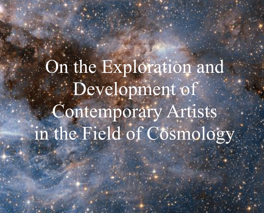
I hope that through this essay to let the readers and viewers feel the contemporary art in the field of cosmology shine. […]
MyBlog – recent issues
We have recently migrated the MyBlog service to new infrastructure. The go-live on the new servers was Thurs 7 Feb 0900 (approx). Since the migration we have been experiencing periods of downtime caused by the MyBlog database being corrupted. Symptoms include: The homepage not being available: The root level site becomes corrupted after which browsers […]
myblog.arts updated
myblog.arts was updated on 14th July 2015 to use the latest version of WordPress. Here are a couple of short videos giving an overview of some of the new features since version 4: You should now be able to preview videos and image slideshows directly in the post and page editor, […]
myblog.arts maintenance – 14th July 2015
myblog.arts will be offline on 14th July 2015 at 11am, for approximately one hour, while an update is applied to the WordPress software. This update brings the latest WordPress features and some important security fixes to the platform. Apologies in advance for any inconvenience caused. […]
myblog.arts network issues
There continue to be network issues at UAL which affect myblog.arts. We are waiting to hear about progress on this from the IT department. In the meantime some parts of the myblog.arts home page have been temporarily disabled. Individual blogs on the site are unlikely to be affected. […]
myblog.arts and UAL network issues
There are ongoing issues with UAL’s network which are causing problems with some pages here at myblog.arts. Most individual blogs are working, but in some cases pages may load slowly. The home page of myblog.arts is affected and may load slowly. Recent post summaries have been temporarily disabled. The IT department are working on fixing […]
myblog.arts – Terms and Conditions updated
I updated the Terms and Conditions page today to clarify the situation with the long-term availability of blogs created on myblog.arts. See the section title ‘Blog and User Lifecycles’. Unfortunately we have to prune old content in order to keep the system at a manageable size. However, there is the facility to export your blog […]
myblog.arts scheduled maintenance
Myblog.arts will be offline for approximately 30 minutes from 9pm this evening, Monday 9th March 2015. This is to allow for essential maintenance work on the web server to take place. Please notify colleagues if you think they will be affected. Thanks for your understanding. — myblog.arts team […]